
Color Harmony Palettes That Bring Every Home Style to Life
Discover 21 Sherwin-Williams color harmony palettes designed to inspire your next home project. Each palette blends timeless hues that are easy to find, affordable, and truly livable—because beautiful color should feel personal, not perfect.
10/11/20257 min read
21 Color Harmony Palettes That Bring Every Home Style to Life
Introduction
Color harmony is more than coordination—it’s emotion on your walls. A balanced palette can make a small kitchen feel warm and inviting or turn a bedroom into a soft retreat at the end of the day. After years of painting my own homes (and helping friends rescue theirs from bad beige), I’ve come to trust Sherwin-Williams. Their paints are easy to find, affordable, and true-to-tone—meaning the shade you fall in love with on the swatch actually looks that way once it dries.
In this guide, you’ll find 21 color harmony palettes grouped by mood. Each set blends real Sherwin-Williams hues you can pick up at nearly any paint counter, so you can duplicate these looks at home without guesswork. You’ll also find vivid scene descriptions—Picture This—to help you imagine how these colors come alive in different rooms and home styles.
Soft Whispers – Serene Neutrals
These palettes soothe the senses and balance natural light. Ideal for cottages, transitional homes, and any space craving calm.
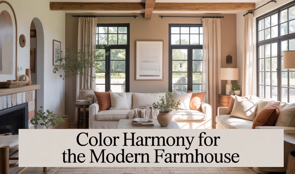
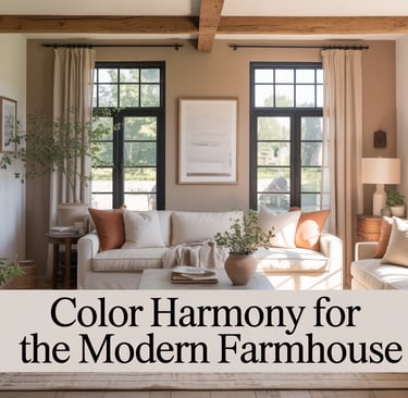
Palette 1 – Feather Gray Calm
Accessible Beige SW 7036 #D6CFC4 • Alabaster SW 7008 #EDE9DD • Ethereal Mood SW 7639 #C6C8C3 • Urbane Bronze SW 7048 #54504E
A timeless mix of taupe, soft white, and stone gray that flatters wood and linen textures. Perfect for open living areas where daylight shifts throughout the day.
Picture This:
A sunlit farmhouse living room with creamy-beige walls inspired by Sherwin-Williams Accessible Beige, rustic oak beams, a slip-covered sofa, and linen drapery. A matte black metal coffee table grounds the space while bronze accents echo the trim’s subtle depth.
Palette 2 – Stone Cottage
Shoji White SW 7042 #E9E4DA • Drift of Mist SW 9166 #DFDDD7 • Natural Tan SW 7567 #D8CAB3 • Iron Ore SW 7069 #434343
Gentle off-whites paired with a grounding charcoal; a palette that feels both rustic and elegant.
Picture This:
A cottage kitchen with walls painted in a warm off-white inspired by Shoji White, open shelves of natural wood, and black-framed windows overlooking a garden. Brass fixtures glint softly against pale stone countertops.
Palette 3 – Winter Pearl
Egret White SW 7570 #E3DED6 • Repose Gray SW 7015 #CCC7BF • Crushed Ice SW 7647 #D7D5CE • Dovetail SW 7018 #8A8279
Cool-toned neutrals layered for dimension—great for modern minimal interiors.
Picture This:
A serene bedroom wrapped in misty gray inspired by Repose Gray, upholstered headboard in soft oatmeal fabric, gauzy curtains filtering northern light. Matte black sconces add crisp contrast for a Scandinavian-meets-modern feel.
Fireside Glow – Warm & Cozy Tones
Warm palettes invite conversation and pair beautifully with natural textures like rattan, terracotta, and worn leather.
Palette 4 – Autumn Hearth
Cavern Clay SW 7701 #B66E41 • Creamy SW 7012 #EAE1D2 • Toasty SW 6095 #D6B18B • Dark Clove SW 9183 #5B4232
A rich terracotta anchored by creamy neutrals—instantly cozy.
Picture This:
A bungalow dining room where sun warms clay-colored walls inspired by Cavern Clay. A reclaimed-wood table sits beneath a woven pendant light; pottery in cream and cinnamon tones decorates the shelves.
Palette 5 – Golden Afternoon
Honey Bees SW 9018 #E5B955 • Wheat Penny SW 7705 #B4744E • Antique White SW 6119 #ECE3CE • Foothills SW 7514 #8B7761
Sun-kissed ambers and golden neutrals radiate warmth without overpowering.
Picture This:
A cozy breakfast nook painted in a buttery neutral inspired by Antique White, filled with morning light bouncing off honey-toned cabinets. Rattan chairs and a striped linen tablecloth add subtle texture.
Palette 6 – Cinnamon Comfort
Reddened Earth SW 6053 #B66C53 • Canvas Tan SW 7531 #D8C7B1 • Baked Clay SW 6340 #C16F56 • Black Fox SW 7020 #4B4743
A sophisticated take on rustic red tones—balanced and earthy.
Picture This:
A craftsman-style living room with walls in a muted terracotta inspired by Reddened Earth, layered rugs, caramel leather sofa, and black-fox trim outlining vintage windows. Candlelight flickers across aged brass lamps.
Rooted Calm – Earthy Greens & Naturals
Green tones restore and ground; perfect for studies, sunrooms, or entryways.
Palette 7 – Sage Stillness
Clary Sage SW 6178 #B6B297 • Greek Villa SW 7551 #F0ECE4 • Silver Strand SW 7057 #BEC2BC • Sable SW 6083 #7A6456
Tranquil and organic, echoing nature’s balance.
Picture This:
A modern farmhouse mudroom with walls in soft sage inspired by Clary Sage, white shiplap wainscoting, woven baskets, and weathered boots by the bench. The light feels calm and herbal, like morning air after rain.
Palette 8 – Olive Retreat
Rosemary SW 6187 #5B6054 • Neutral Ground SW 7568 #DDD3C4 • Ligonier Tan SW 7717 #BCA388 • Iron Ore SW 7069 #434343
An elegant mix of soft olive and grounded tan that suits traditional and transitional spaces.
Picture This:
A library with walls in an earthy olive inspired by Rosemary, built-in bookshelves trimmed in dark charcoal, brass picture lights, and linen-bound books. A caramel velvet chair anchors the corner beneath a reading lamp.
Palette 9 – Fern Haven
Softened Green SW 6177 #C0B9A0 • Ivory Lace SW 7013 #EEE7DD • Enduring Bronze SW 7055 #615951 • Cilantro SW 9676 #73755E
Balanced greens with creamy highlights—fresh yet timeless.
Picture This:
A bright kitchen where cabinetry glows in muted green inspired by Softened Green, paired with ivory-lace walls and aged-bronze hardware. Open shelving displays white pottery and herbs in terracotta pots.
Seaside Ease – Breezy Blues & Coastal Calm
Blue palettes lend clarity and serenity. Use them in bedrooms, baths, and open-air living spaces.
Palette 10 – Coastal Mist
Sea Salt SW 6204 #CBD5D0 • Snowbound SW 7004 #ECE9E3 • Misty SW 6232 #CDD3D4 • Gray Screen SW 7071 #C5C6C4
A whisper of sea glass and mist—light, airy, and effortlessly coastal.
Picture This:
A seaside-inspired bedroom painted in a pale blue-green inspired by Sea Salt, whitewashed furniture, rattan pendant lamps, and gauzy curtains dancing in the breeze from an open window.
Palette 11 – Harbor Haven
Sleepy Blue SW 6225 #A7C2D3 • Pure White SW 7005 #F4F1EB • Morning Fog SW 6255 #B8BDC2 • Naval SW 6244 #2F3D4C
Soft blue layers with a navy anchor tone—perfect for coastal or lake-house charm.
Picture This:
A crisp coastal living room with walls in light misty blue inspired by Sleepy Blue, trimmed in bright white, linen sofas, driftwood tables, and a navy feature wall framing nautical artwork.
Palette 12 – Ocean Frame
Icy SW 6534 #C1D3DE • Reflection SW 7661 #C7D1D3 • Debonair SW 9139 #88A6AF • Smoky Azul SW 9132 #5F7E8A
Cool, refreshing blues that feel like waves under shifting light.
Picture This:
A modern bathroom wrapped in serene blue inspired by Debonair, with crisp white tile, brushed-nickel fixtures, and soft towels stacked near a freestanding tub overlooking the sea through glass doors.
Blushing Light – Romantic Pinks & Mauves
These palettes create softness without sweetness. Perfect for bedrooms, powder rooms, or any space that benefits from warmth and charm.
Palette 13 – Rose Linen
Intimate White SW 6322 #F6E8E1 • Romance SW 6323 #F3DAD4 • Malted Milk SW 6057 #D1B7AA • Smoky Beige SW 9087 #B59E90
A whisper of rose with a hint of beige—delicate, livable, and endlessly flattering.
Picture This:
A cottage bedroom with walls in a pale blush inspired by Intimate White, crisp white bedding, linen curtains, and vintage brass lamps. A woven bench at the end of the bed grounds the softness with texture.
Palette 14 – Mauve Season
Rosé SW 6290 #E3B7B1 • Angora SW 6036 #D2C3B9 • Urban Putty SW 7532 #C7B19E • Urbane Bronze SW 7048 #54504E
Elegant and muted, with gray undertones for modern depth.
Picture This:
A Parisian-inspired sitting room painted in a dusty rose inspired by Rosé, adorned with plaster moldings, a velvet sofa, and oil paintings in antique gold frames. Afternoon light glows softly through sheers.
Palette 15 – Terra Blush
Spice Delight SW 6635 #E5B79D • Mellow Coral SW 6324 #E49B8D • Moderate White SW 6140 #E9E0D2 • Warm Stone SW 7032 #91867D
A balance between coral, cream, and taupe—uplifting but grounded.
Picture This:
A sunroom painted in a gentle coral inspired by Mellow Coral, paired with creamy trim, natural jute rugs, and a wicker daybed filled with textured pillows. The light feels like late afternoon warmth captured indoors.
Evening Ember – Moody Charcoals & Dramatic Darks
Deep tones add sophistication, contrast, and mood—especially in rooms with controlled lighting or modern details.
Palette 16 – Midnight Loft
Iron Ore SW 7069 #434343 • Extra White SW 7006 #F3F3F2 • Gauntlet Gray SW 7019 #7A7873 • Tricorn Black SW 6258 #2D2D2C
A minimalist monochrome palette that feels dramatic yet balanced.
Picture This:
A downtown loft living area painted in a deep charcoal inspired by Iron Ore, accented with white brick, leather armchairs, and metal-framed windows overlooking the city skyline.
Palette 17 – Ink & Ember
Greenblack SW 6994 #2D3231 • Urbane Bronze SW 7048 #54504E • Shoji White SW 7042 #E9E4DA • Peppercorn SW 7674 #50504C
Smoky neutrals that bridge warm and cool—moody without gloom.
Picture This:
A moody dining room with walls painted in near-black green inspired by Greenblack, balanced by creamy white wainscoting and a reclaimed wood table illuminated by soft pendant light.
Palette 18 – Shadow Veil
Grizzle Gray SW 7068 #666662 • Mindful Gray SW 7016 #B6B1A9 • Pure White SW 7005 #F4F1EB • Black Fox SW 7020 #4B4743
Perfectly layered grays for refined contrast.
Picture This:
A contemporary office painted in a stormy gray inspired by Grizzle Gray, framed art in matte black, oak floors, and a linen chair. The space feels composed, sophisticated, and quietly powerful.
Morning Joy – Fresh Brights & Playful Pastels
Airy tones that lift the mood, making rooms feel spacious, cheerful, and full of light.
Palette 19 – Lemon Cream
Pineapple Cream SW 1668 #F7E8B2 • White Flour SW 7102 #F6F3EC • Creamy SW 7012 #EAE1D2 • Blonde SW 6128 #E1CBA3
Soft yellows and whites that feel fresh and familiar.
Picture This:
A cheerful kitchen with buttery walls inspired by Pineapple Cream, white open shelving, vintage café curtains, and a bowl of lemons on a wooden counter catching the morning sun.
Palette 20 – Misty Meadow
Watery SW 6478 #B7D1CF • Meander Blue SW 6484 #A8D0C7 • Spare White SW 6203 #E4E9E8 • Sea Salt SW 6204 #CBD5D0
Barely-there blues and aquas that breathe light into any space.
Picture This:
A bright laundry room painted in watery aqua inspired by Meander Blue, crisp white cabinetry, and woven baskets. The air feels clean, the colors fresh—perfectly coastal and uplifting.
Palette 21 – Apricot Bloom
Peach Fuzz SW 6617 #F7C9B0 • White Heron SW 7627 #E9E4DC • Creamy SW 7012 #EAE1D2 • Malted Milk SW 6057 #D1B7AA
Warm, inviting, and quietly joyful—a perfect spring neutral.
Picture This:
A modern entryway with walls in soft apricot inspired by Peach Fuzz, paired with creamy trim, a rattan console table, woven baskets, and artwork in warm earth tones. It greets guests with a sense of calm optimism.
Shop the Look
Each of these palettes comes to life when paired with textures, lighting, and decor that complement their tone.
Explore my curated Amazon lists for pieces that bring harmony to your home:
Shop the Look:
Explore my Cottagecore Home, Neutral Home Decor, and Modern Home Finds lists for furniture, textiles, and accents that pair beautifully with these color moods.
Summary
Whether you’re drawn to the serenity of neutrals, the warmth of clay tones, or the breezy calm of coastal hues, each of these Sherwin-Williams color harmony palettes offers a way to bring emotion and personality into your home.
Color doesn’t have to be complicated—just balanced. Choose the mood that feels like you, and start with one room. Maybe it’s your kitchen walls, your bedroom trim, or a cozy corner that needs a little love. Paint is transformation in a can, and with these harmonized hues, your home can feel as welcoming and inspired as you imagine.